Service:
Packaging Redesign
Industry:
Food & Beverage
Year:
2025

Jarritos

The Jarritos project is a packaging redesign that gives the classic soda a bold, hand-crafted look. The core goal was to modernize the brand while preserving its energetic and playful spirit. The design features a burst-inspired fruit graphic and a textured paper feel. Crucially, the iconic jar shape was maintained as part of the logo to honor the history of the drink. By simplifying shapes and emphasizing color, the new look highlights Jarritos' authentic roots and refreshing personality in a fun, contemporary way.

Jarritos
Jarritos
Jarritos
Jarritos

Next

HighTea

Project

Service:
Packaging Redesign
Industry:
Food & Beverage
Year:
2025

Jarritos

The Jarritos project is a packaging redesign that gives the classic soda a bold, hand-crafted look. The core goal was to modernize the brand while preserving its energetic and playful spirit. The design features a burst-inspired fruit graphic and a textured paper feel. Crucially, the iconic jar shape was maintained as part of the logo to honor the history of the drink. By simplifying shapes and emphasizing color, the new look highlights Jarritos' authentic roots and refreshing personality in a fun, contemporary way.

Jarritos

Objective:

  • To modernize the Jarritos brand packaging while maintaining its energetic and playful spirit.
  • To create a bold, hand-crafted look that stands out on the shelf.
  • To preserve the iconic jar shape as a key logo element to honor the drink's history and authentic roots.
  • To highlight the drink's natural vibrancy through graphic elements and texture.

Results:

  • Developed a modern, eye-catching packaging design for multiple flavors.
  • Successfully incorporated burst-inspired fruit graphics and a textured feel to convey natural ingredients.
  • The final design successfully integrated the iconic jar symbol while achieving a fun, contemporary aesthetic.
  • The redesign strongly highlights the authentic and vibrant personality of the Jarritos brand.
Jarritos
Jarritos
Jarritos

Next

HighTea

Project

Service:
Packaging Redesign
Industry:
Food & Beverage
Year:
2025

Jarritos

The Jarritos project is a packaging redesign that gives the classic soda a bold, hand-crafted look. The core goal was to modernize the brand while preserving its energetic and playful spirit. The design features a burst-inspired fruit graphic and a textured paper feel. Crucially, the iconic jar shape was maintained as part of the logo to honor the history of the drink. By simplifying shapes and emphasizing color, the new look highlights Jarritos' authentic roots and refreshing personality in a fun, contemporary way.

Jarritos

Objective:

  • To modernize the Jarritos brand packaging while maintaining its energetic and playful spirit.
  • To create a bold, hand-crafted look that stands out on the shelf.
  • To preserve the iconic jar shape as a key logo element to honor the drink's history and authentic roots.
  • To highlight the drink's natural vibrancy through graphic elements and texture.

Results:

  • Developed a modern, eye-catching packaging design for multiple flavors.
  • Successfully incorporated burst-inspired fruit graphics and a textured feel to convey natural ingredients.
  • The final design successfully integrated the iconic jar symbol while achieving a fun, contemporary aesthetic.
  • The redesign strongly highlights the authentic and vibrant personality of the Jarritos brand.
Jarritos
Jarritos

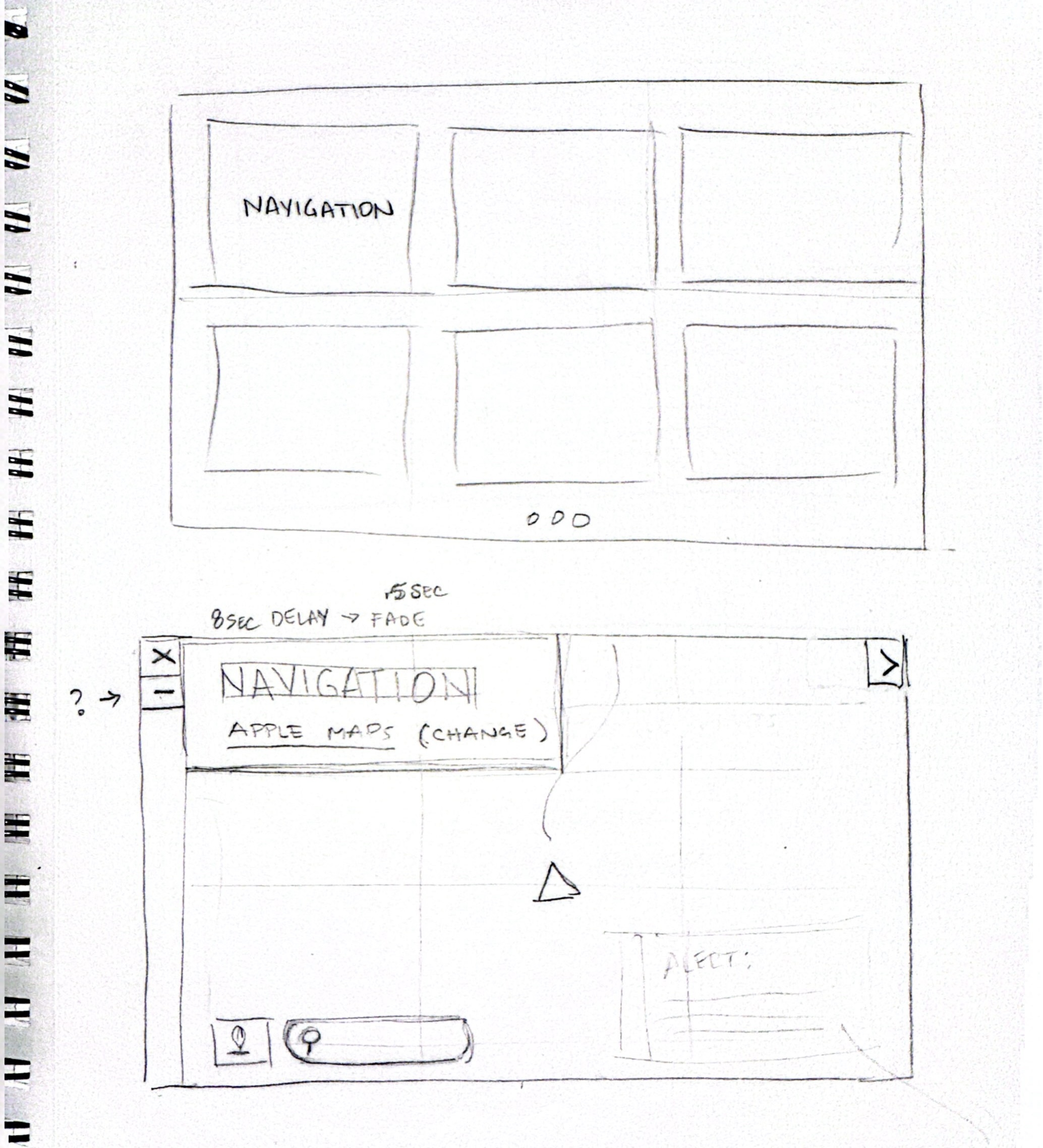
Early Concept and Sketches:

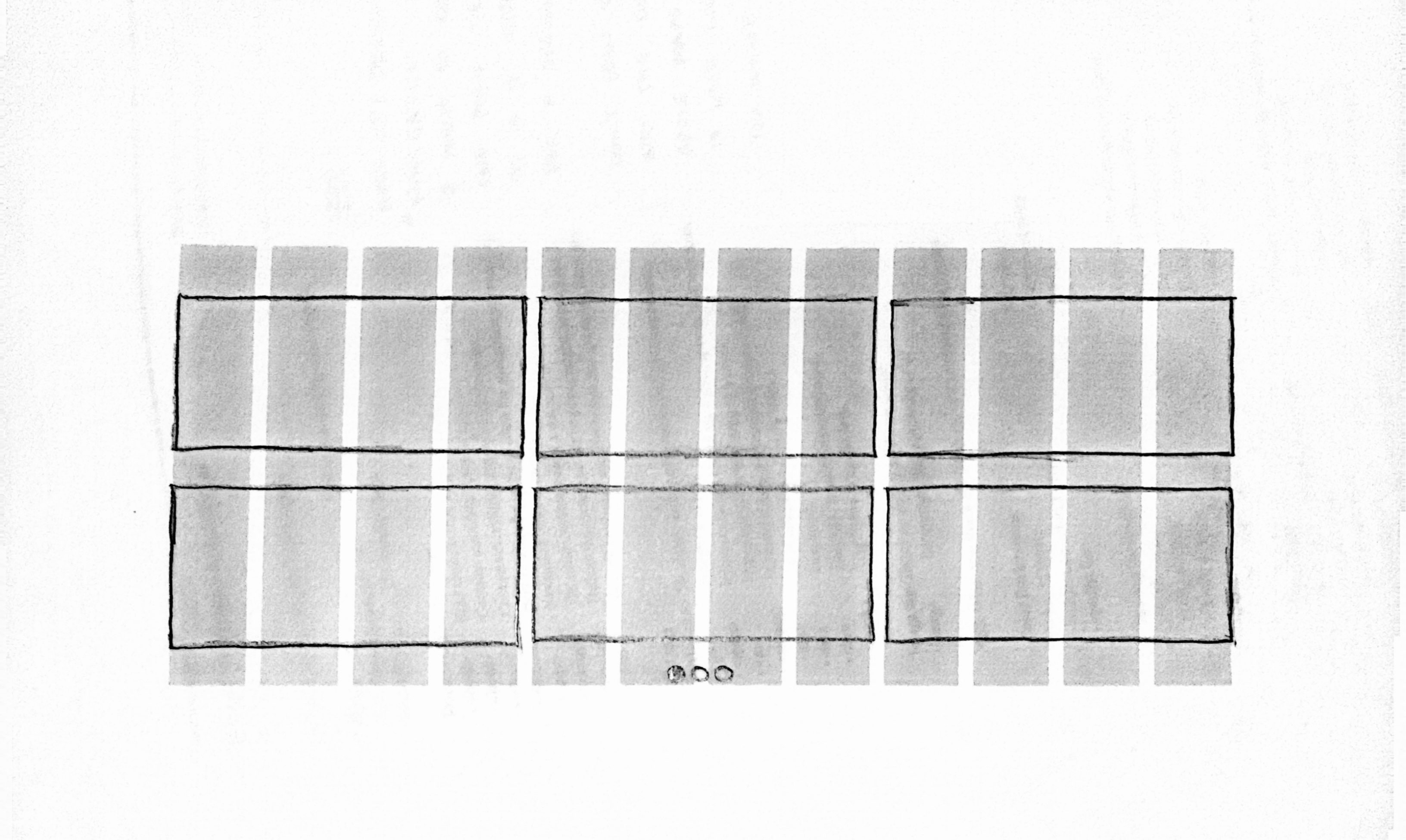
The sketches explore multiple dashboard configurations, including split views, resizable widgets, and dismissible panels. I focused on how drivers might prioritize information differently depending on the trip, such as short commutes versus long highway drives.These concepts helped shape the idea of a flexible grid system and informed how widgets could expand, collapse, or remain persistent on screen.

Companion app:

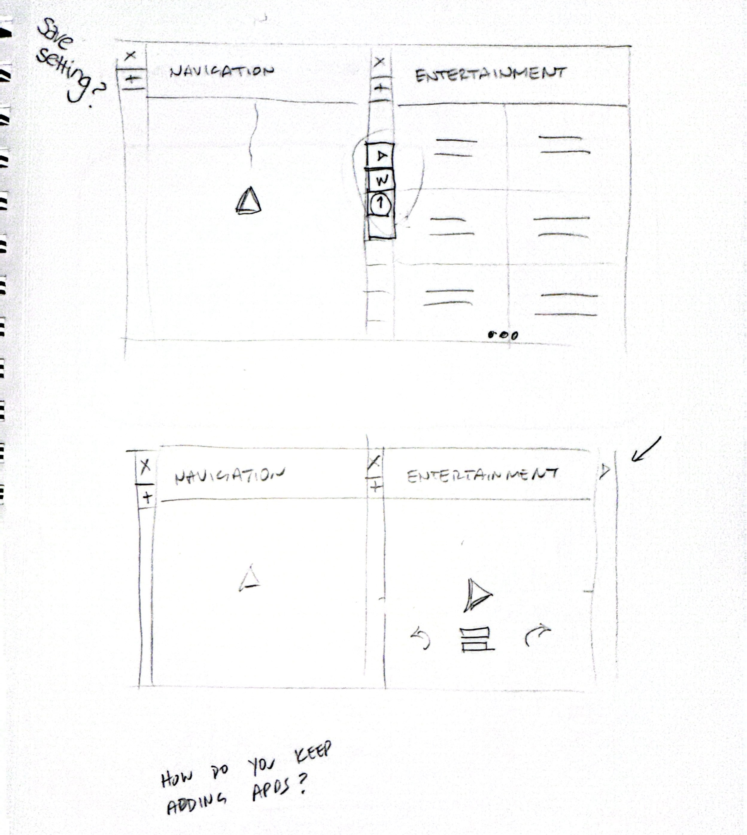
To keep the in-car experience simple and distraction free, customization is handled through a companion mobile app. Drivers can create, save, and switch between dashboard layouts before starting a drive.

This approach allows deeper personalization without adding complexity to the CarPlay interface itself. Layouts can be tailored to different driving scenarios and recalled instantly when entering the car.

Concept development:

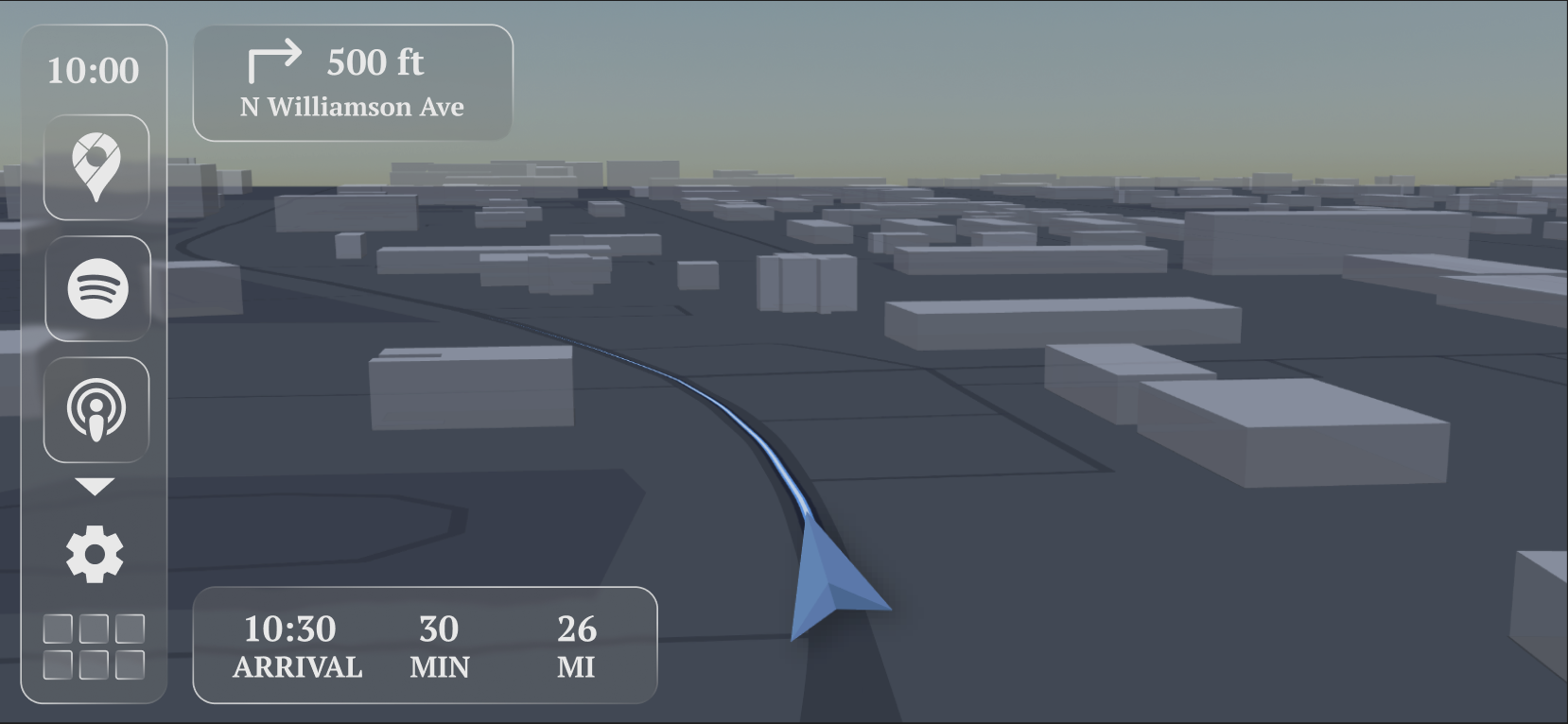
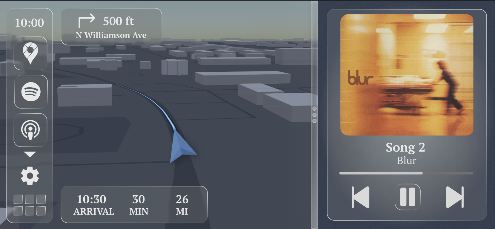
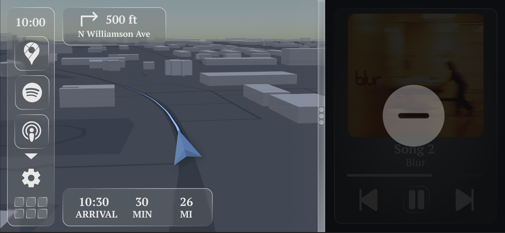
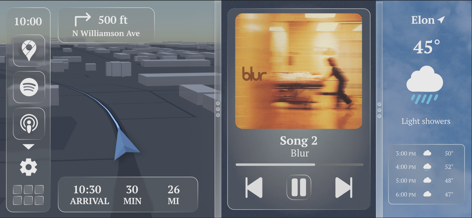
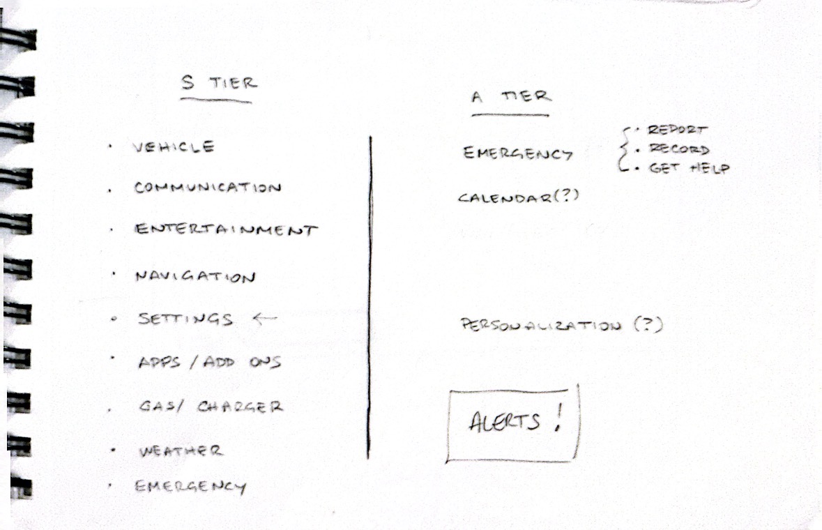
Through iteration, the design converged on a maximum of three widgets displayed simultaneously. This limit balances customization with safety by reducing visual clutter and keeping key information easy to scan.

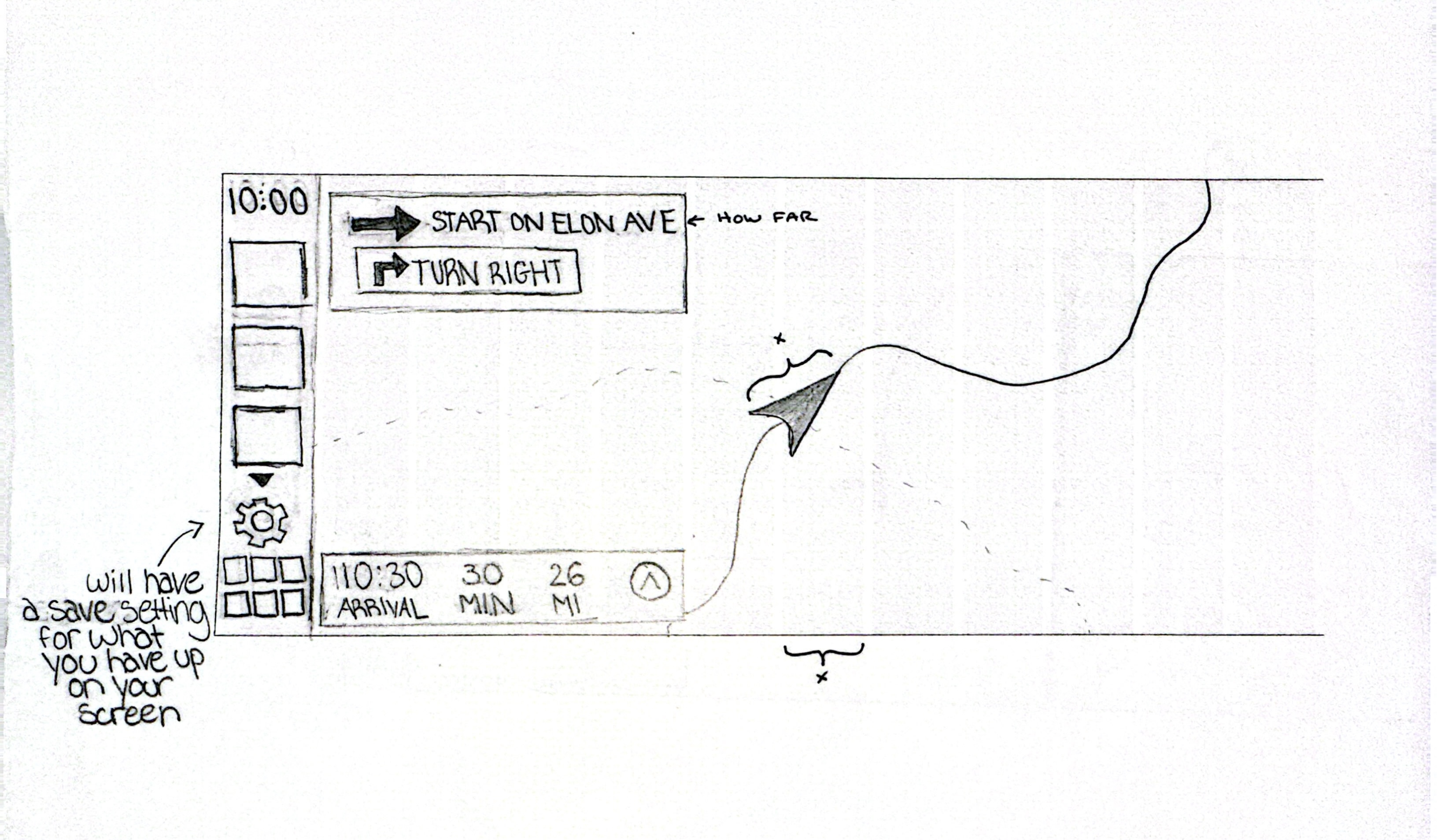
A forward-facing 3D navigation view was introduced to improve spatial awareness and reduce the mental effort required to interpret turns, depth, and distance. The navigation experience was designed to feel grounded in the real world rather than abstract.

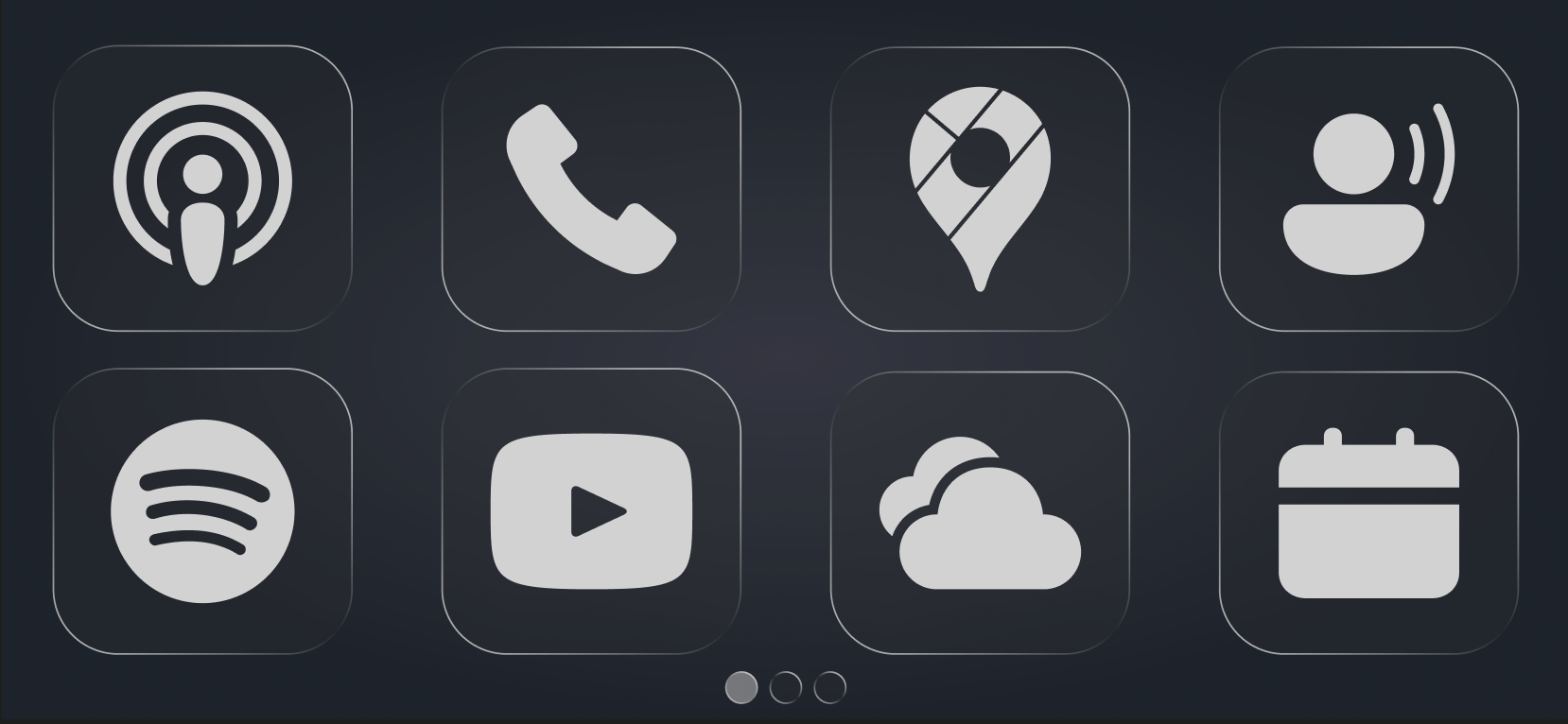
Each widget is designed to be resizable and dismissible with minimal interaction, prioritizing quick glances over prolonged engagement.

building the 3d navigation:

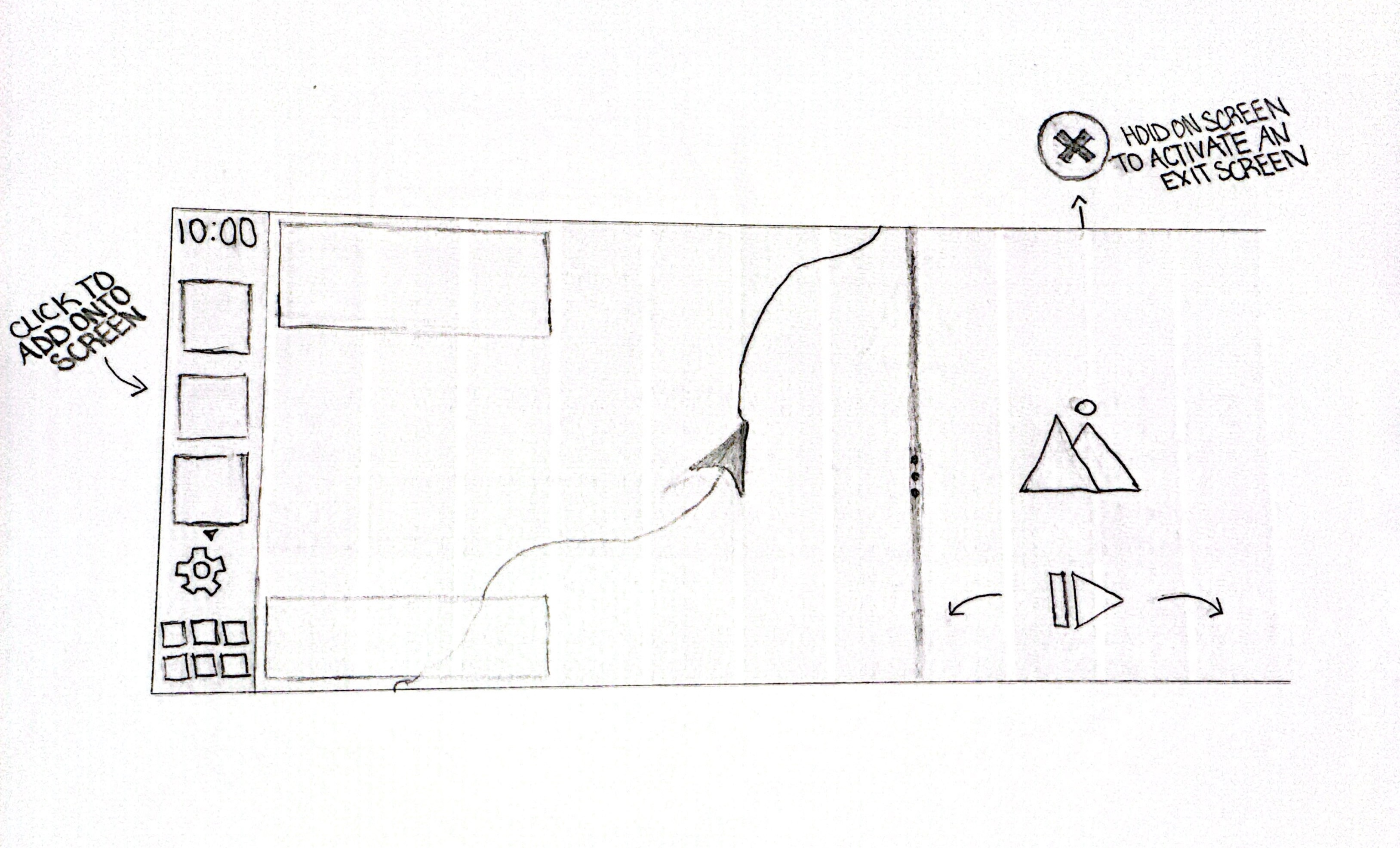
To explore a more realistic navigation experience, I built a forward-facing 3D map prototype rather than using a traditional top-down view. The goal was to reflect how drivers perceive space while moving, using depth and perspective to improve glanceability and spatial awareness.

I prototyped the map using Mapbox and JavaScript, iterating heavily on camera behavior. Small changes to pitch, zoom, and forward offset dramatically affected how immersive the experience felt. Starting navigation further down the route and bringing the camera closer to surrounding buildings helped the environment feel like “driving through” a city instead of observing it from above.

I also refined color, contrast, and route smoothing to keep the interface calm and readable in motion. These technical explorations directly informed the final CarPlay concept, reinforcing forward motion as the primary visual cue and reducing cognitive load during driving.

AI was used as a collaborative tool during this phase to accelerate testing and iteration, while all final design and interaction decisions were made intentionally.

final solution:

The final concept presents a flexible CarPlay dashboard that adapts to different driving needs. Navigation, media, and secondary widgets work together within a consistent visual system designed for clarity and ease of use.

The interface emphasizes forward motion, spatial context, and minimal interaction, creating a calmer and more intuitive driving experience.

Results:

The redesigned system improves navigation glanceability through a forward-facing 3D map view. Drivers can customize their dashboard layout to match different driving contexts. Multiple widgets can remain visible at once, reducing the need for app switching. Widget resizing improves visual hierarchy and quick-glance usability. A companion app separates setup from driving, reinforcing safety-first design.

Overall, the concept demonstrates a more flexible, intuitive, and driver-adaptive CarPlay experience.

Reflection:

This project pushed me to think critically about interface design in high-attention environments. It reinforced the importance of hierarchy, restraint, and context-aware customization. If expanded further, I’d explore real-world user testing, voice-based interactions, and adaptive layouts that respond automatically to driving behavior.

Next

HighTea

Project