Objective:
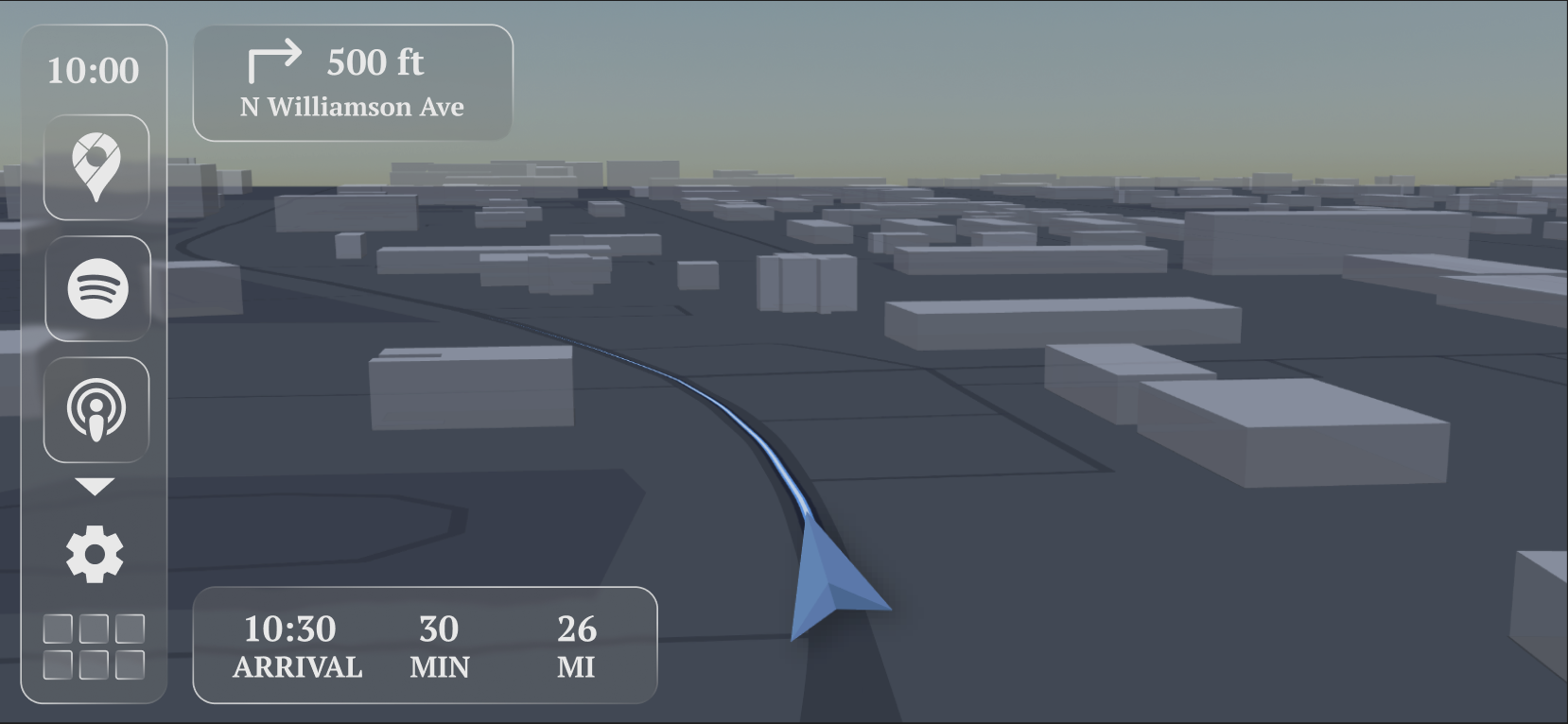
Apple CarPlay is intentionally simple, but its fixed layouts can feel limiting in real driving scenarios. Drivers often need different information depending on the situation, such as navigation during city driving or media and weather during longer trips. Switching between apps interrupts focus and adds unnecessary friction.
The challenge was to design a system that adapts to the driver’s needs without overwhelming the screen or compromising safety.
The Problem:
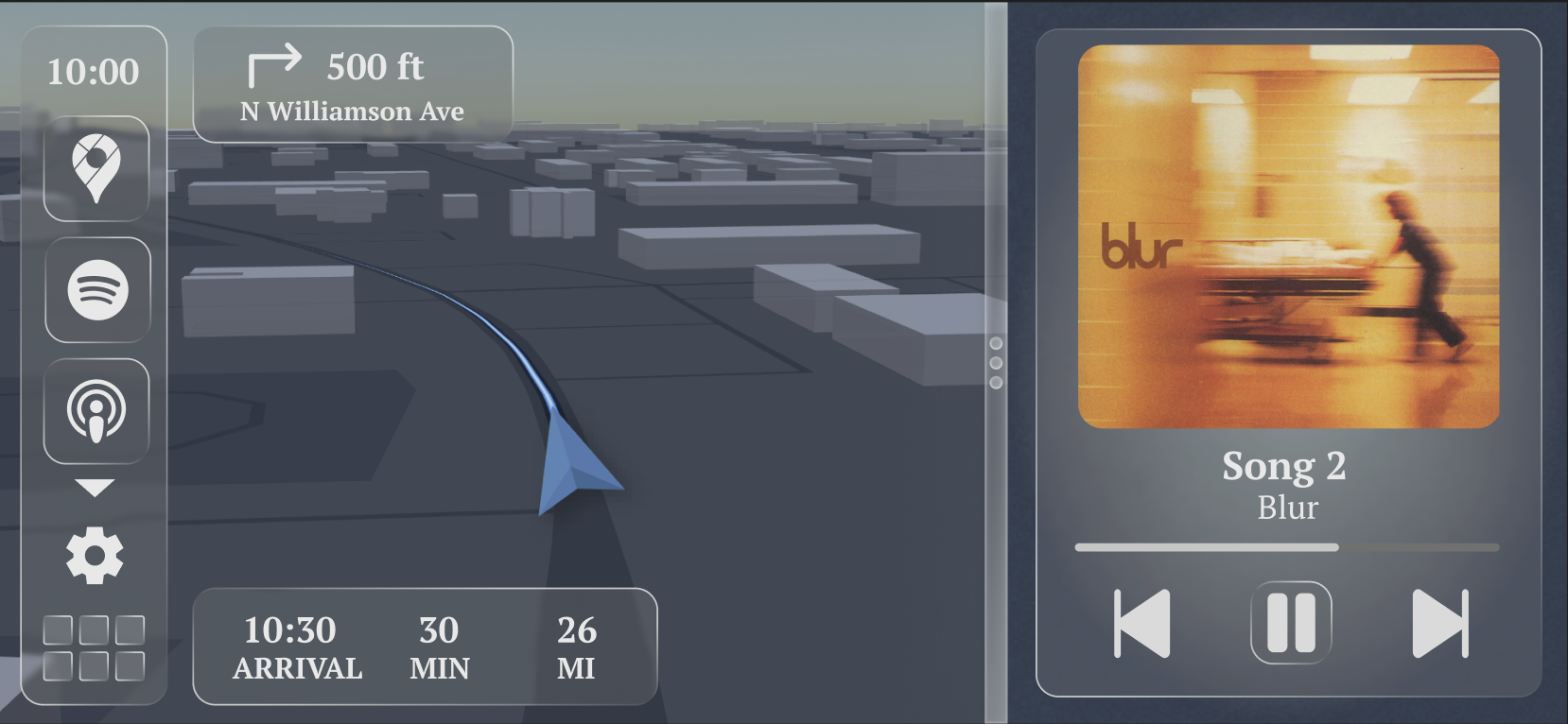
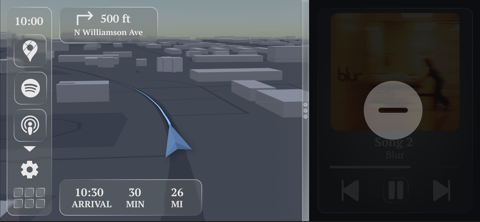
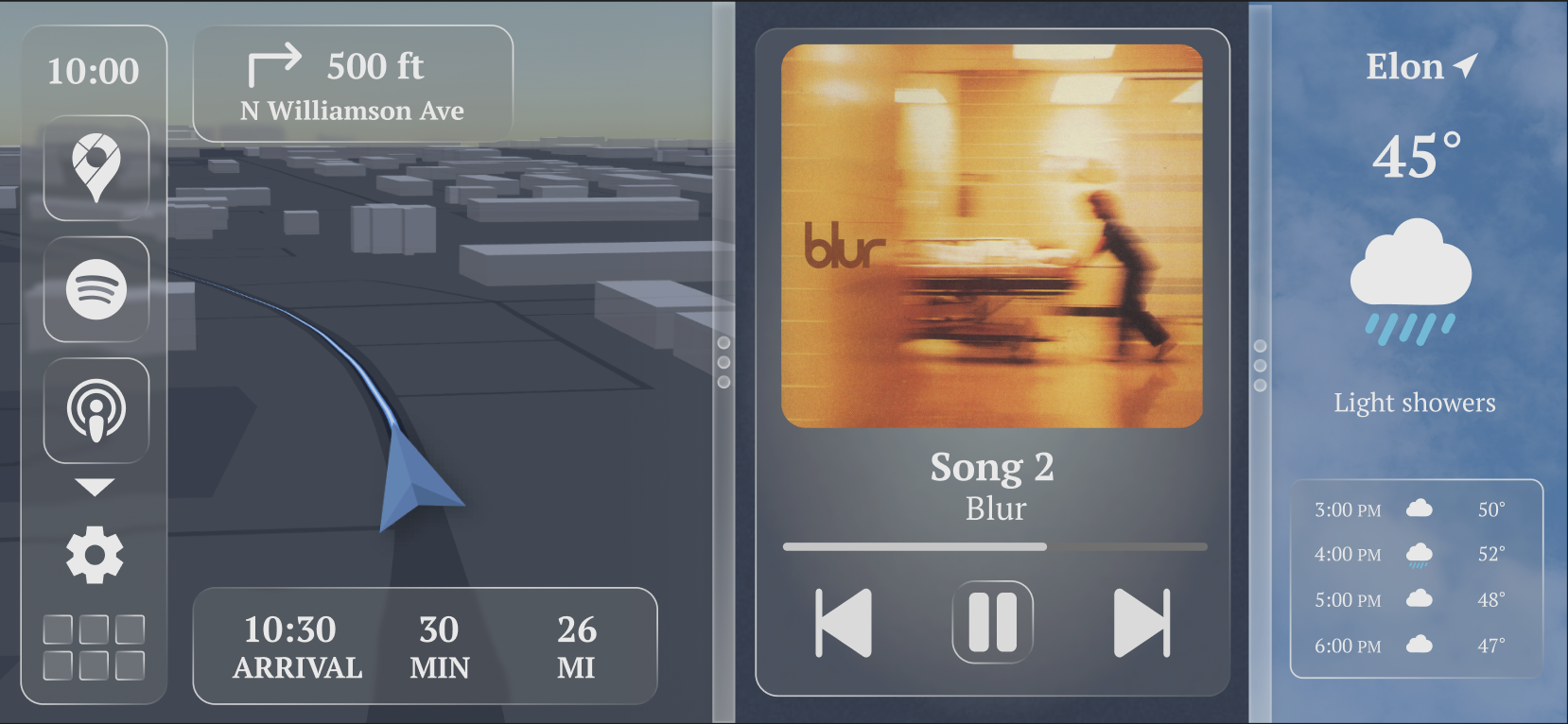
The main objective of this redesign is to create a more intuitive and personalized CarPlay experience. I focused on solving common driver frustrations by improving navigation clarity, making the layout fully customizable, and allowing multiple widgets to stay open at once. The overall goal is a system that adapts to the driver rather than forcing the driver to adapt to the system.
Research and Exploration:
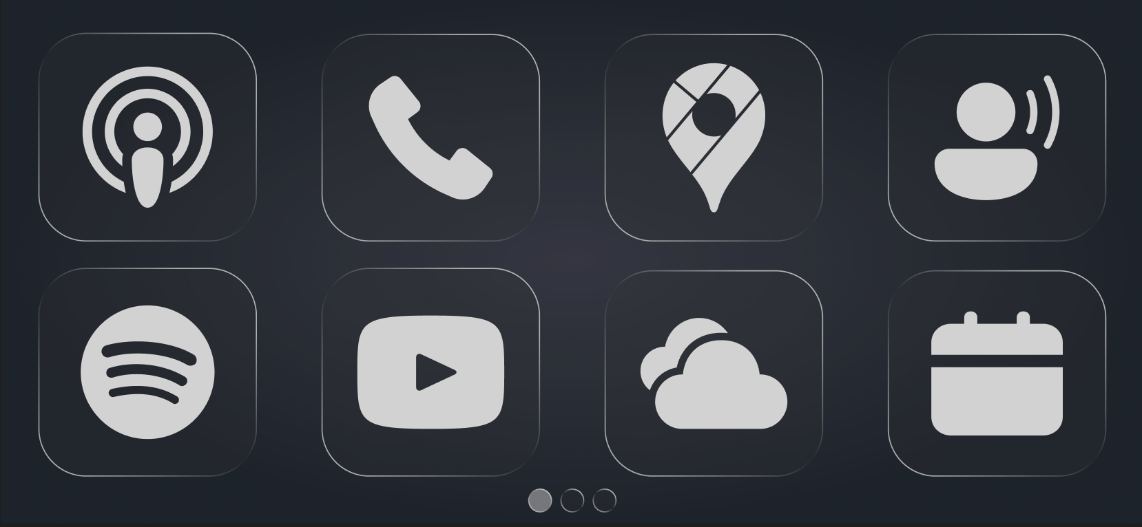
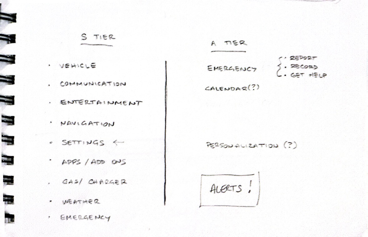
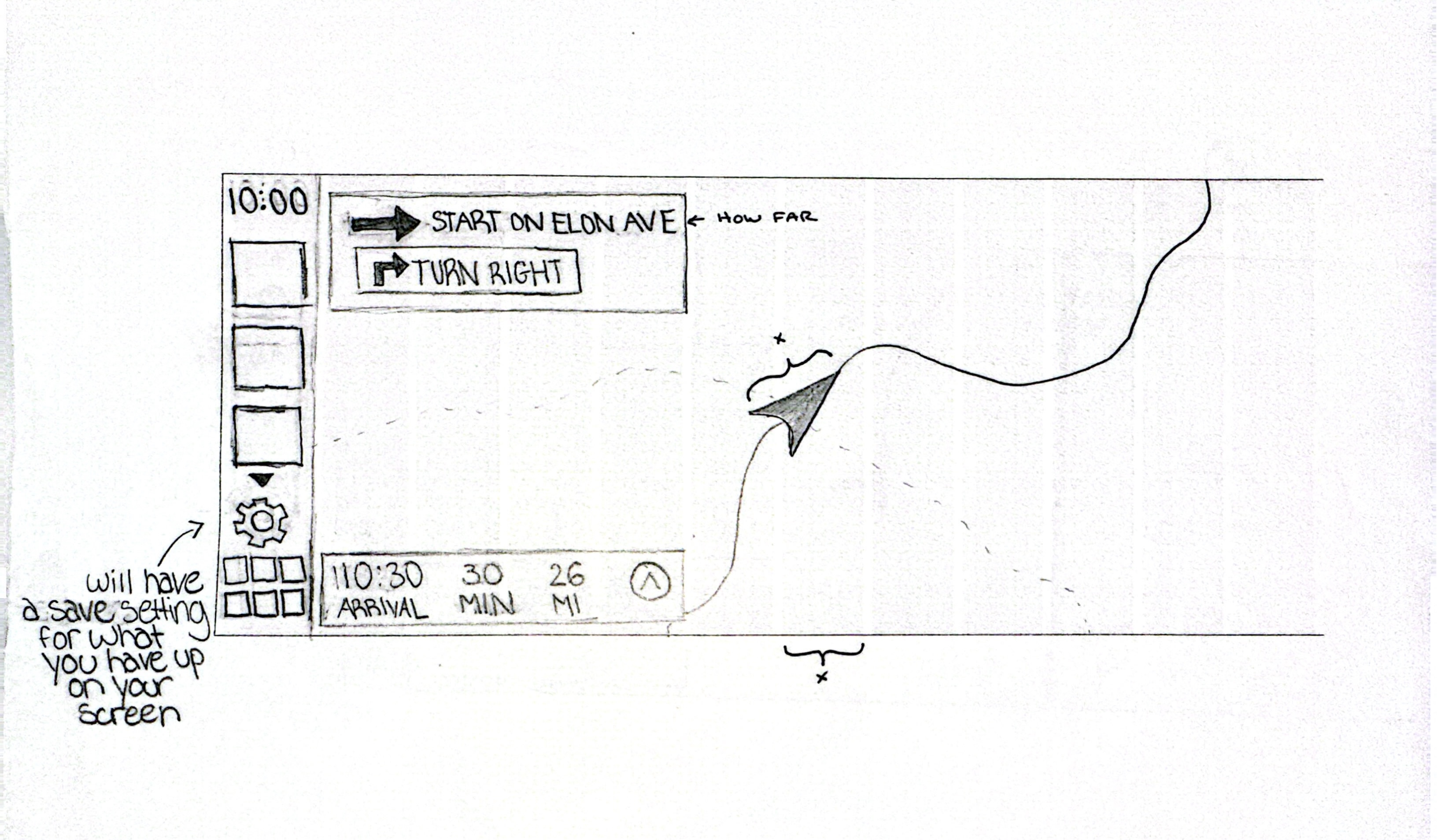
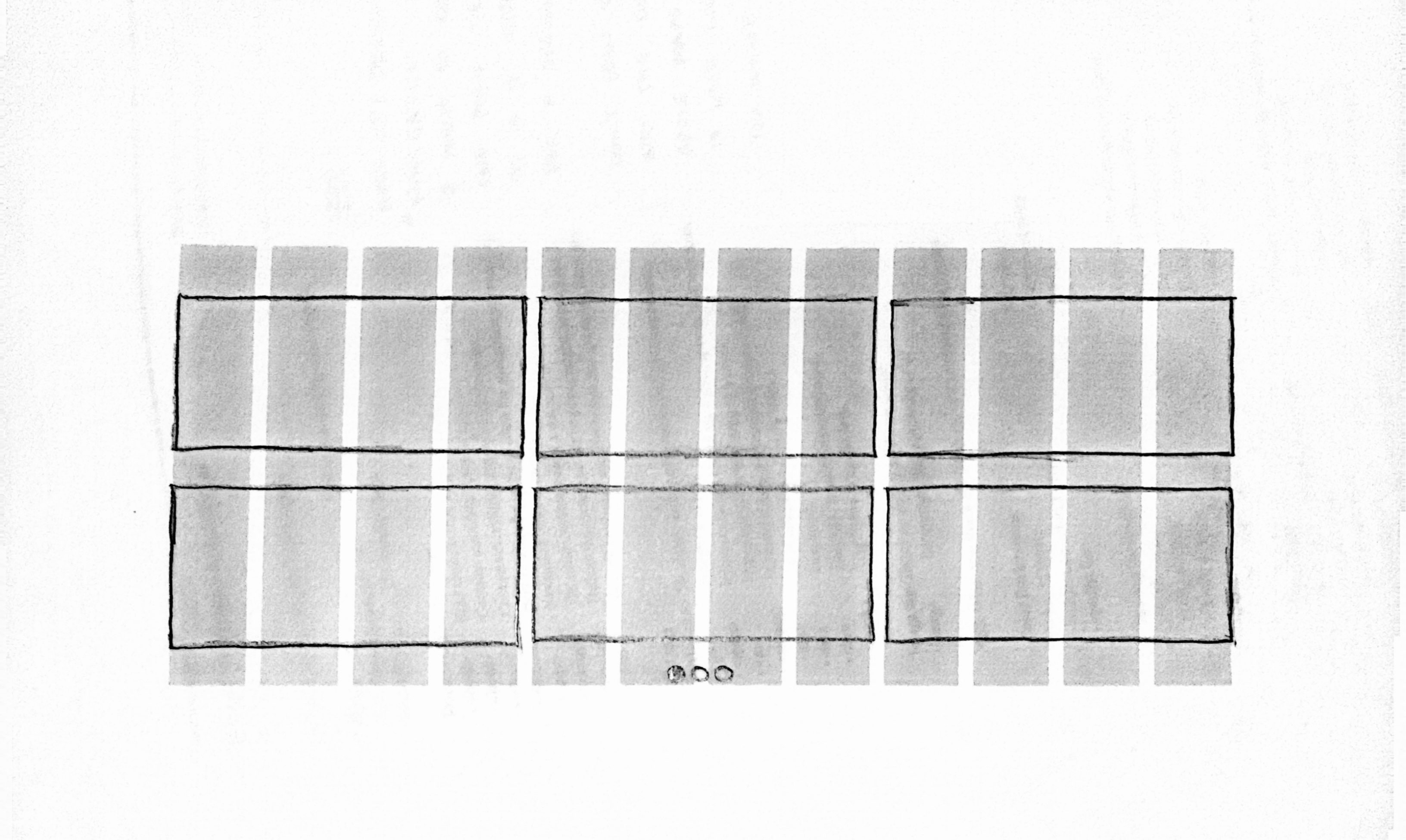
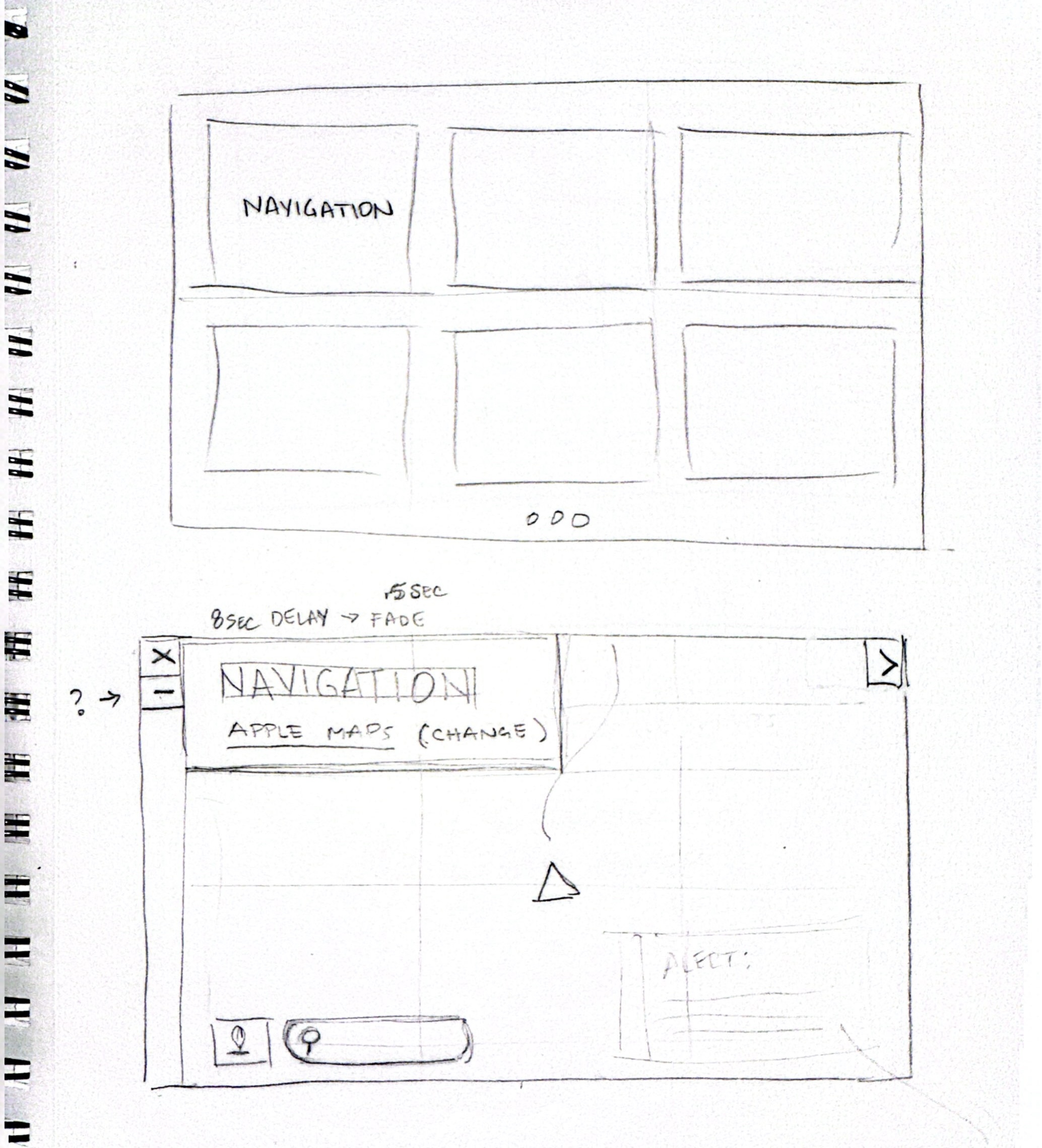
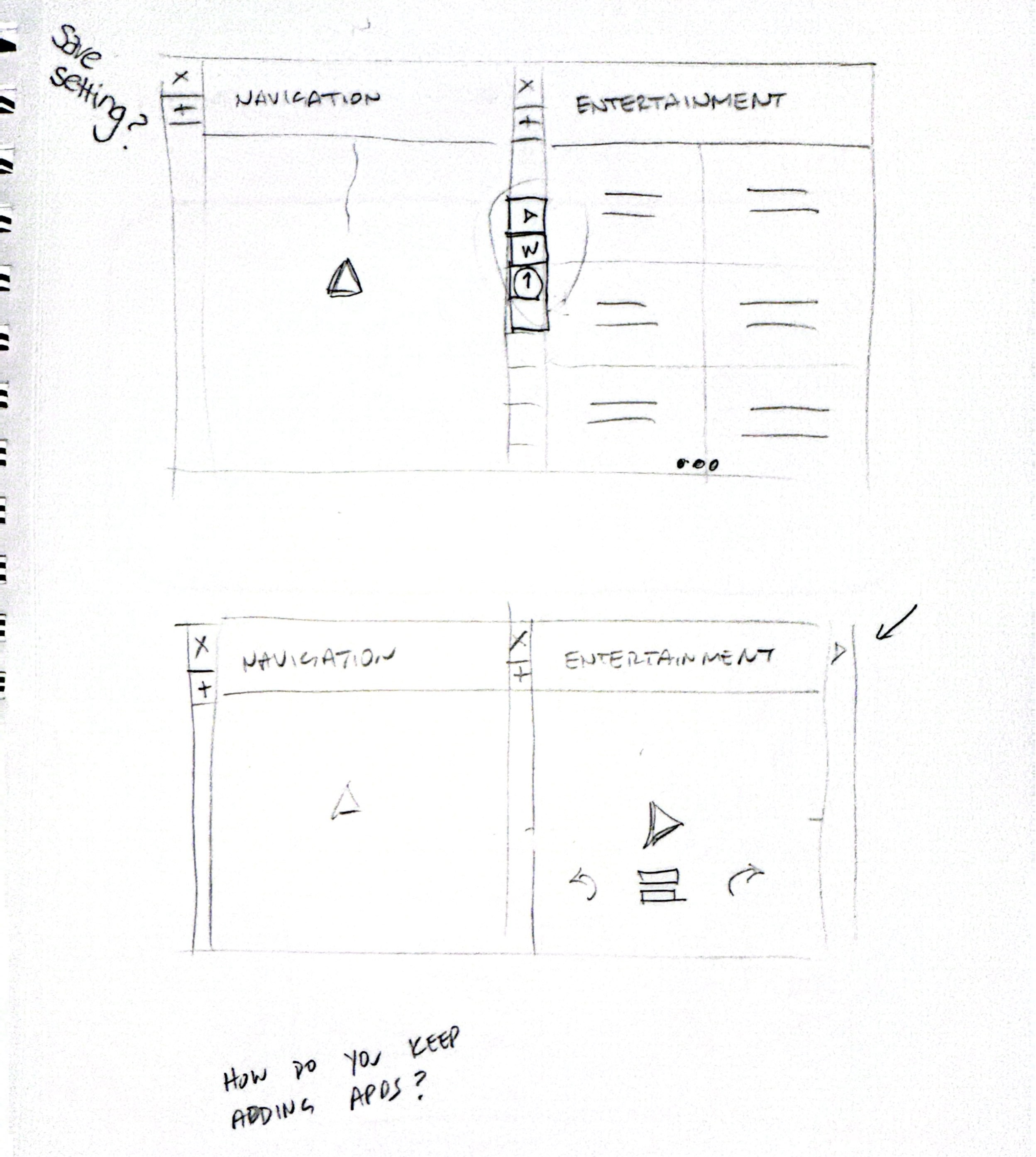
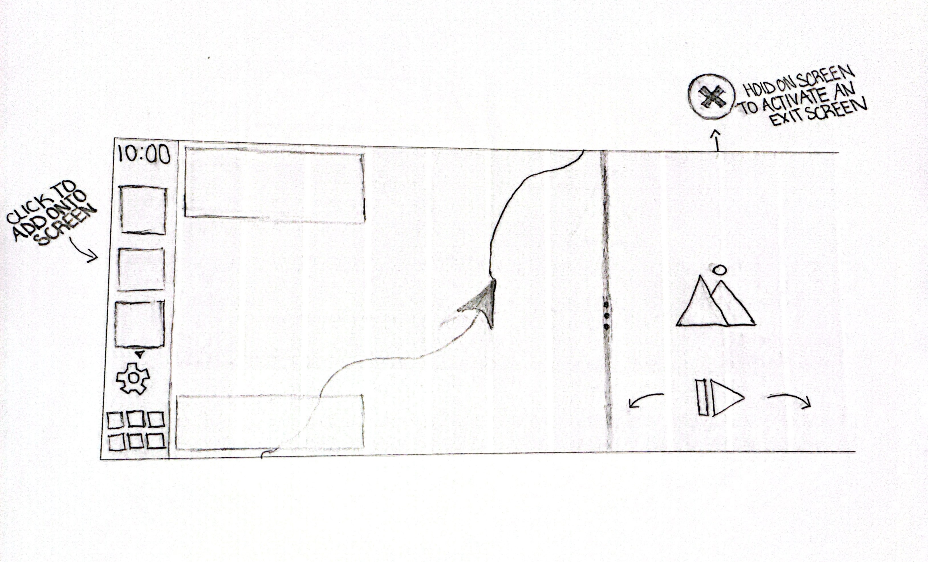
I began by exploring how CarPlay could support modular layouts while maintaining a clear visual hierarchy. Early sketches focused on how navigation, media, and secondary information could coexist without competing for attention.
I tested different grid structures, widget behaviors, and interaction patterns to understand how much flexibility could be introduced without increasing cognitive load. These explorations helped define boundaries around layout limits, interaction simplicity, and information density.